Our team was tasked with refreshing our email visual system and templates. It led to a jump from an 8% open rate to 23%.
Company
Udacity
Role
Art Director
team
Marketing Associates, Copywriter, Project Manager
Process:
1.
While the team was asking for a template system, I wanted to be sure it would be flexible and actionable so we made a simple wireframe. Listening to the various stakeholders, I identified key assets.


2.
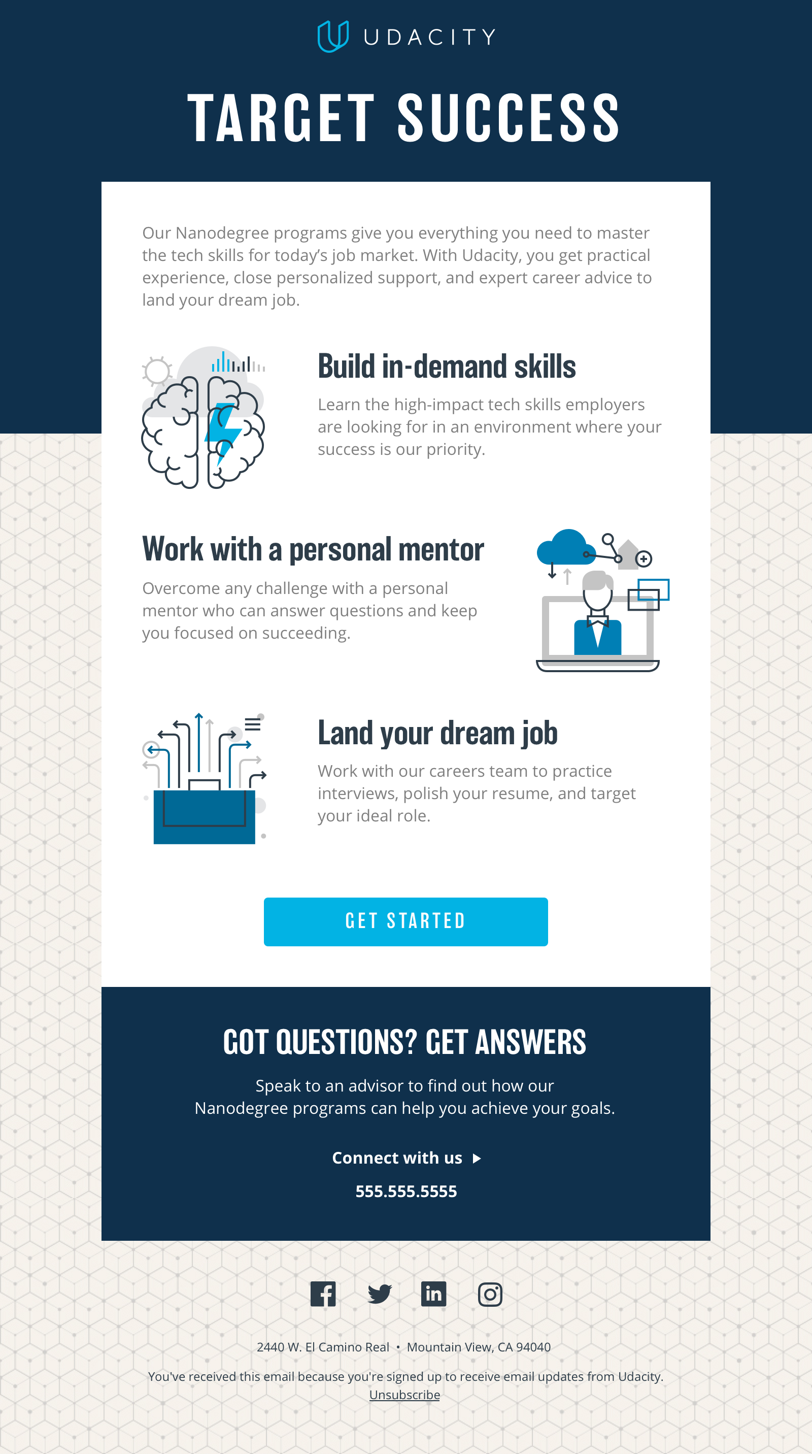
Udacity’s style guide leverages gradients as accents. We turned the volume up to help infuse these messages with more energy. Udacity favored no photography in their emails, so we included one version without. My preference was to include more heroic user imagery. We also included a direction that fused the gradients into the photography creating a more organic feel.


3.
Then leadership changed their mind: no gradients. We pivoted. It’s just part of the job and I am used to it. We needed a scalable branding element so we went with a geometric pattern. They’re cubes symbolizing learning as the building blocks of one’s career and life.


ADDITIONALLY…
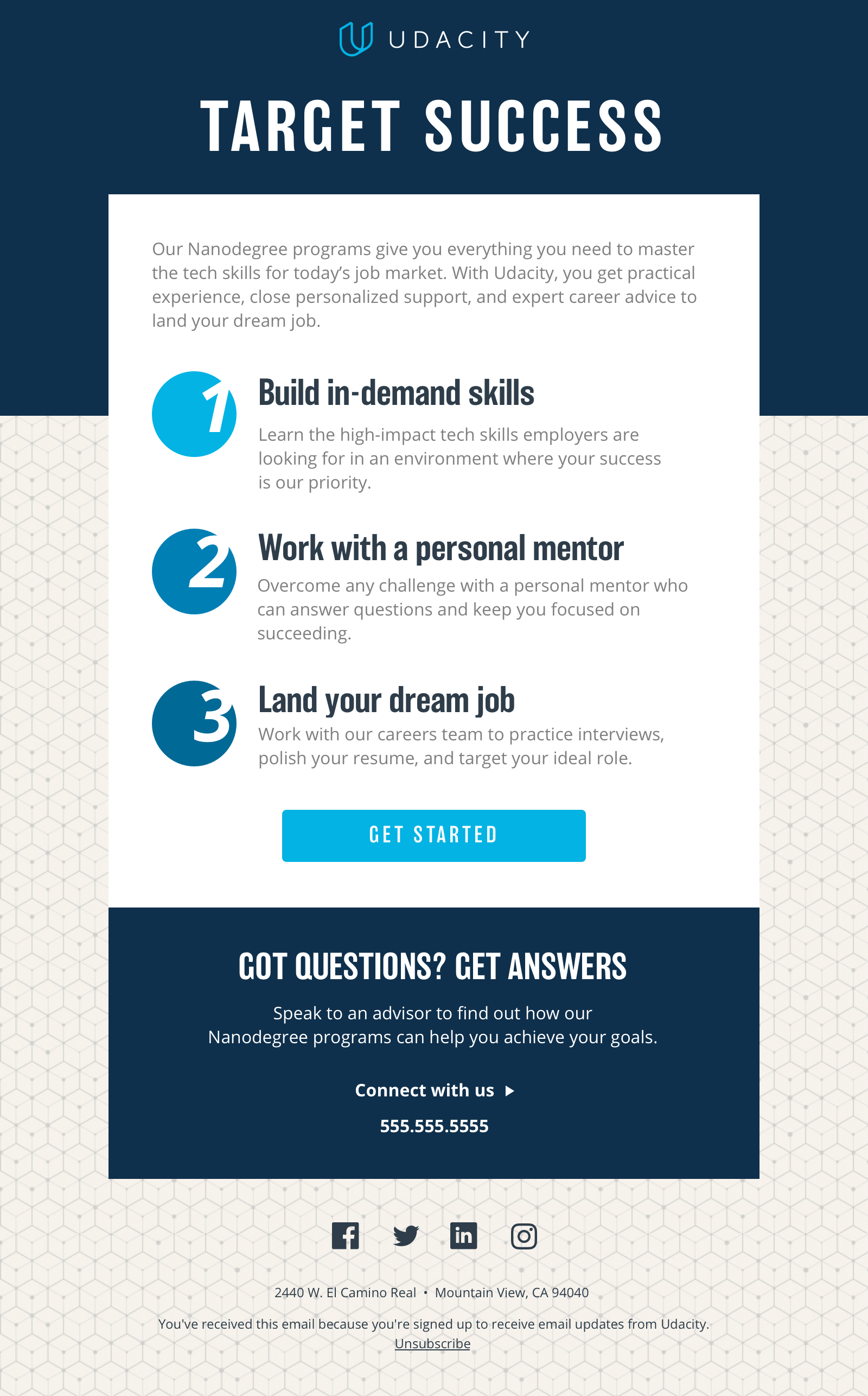
As we began rolling out this new design, we learned some things on the lead generation landing pages. Pages with numbers were converting better than ones with icons so we rolled that out in our emails to test how that idea performed. One of the advantages of working with me is I’m constantly looking to leverage wins in other channels for the projects I’m working on. It’s one of the reasons I love working in-house.